Louise P. Sloane – Geometry, Color, and Texture in Perfect Harmony
A Conversation on Minimalism, Human Connection, and the Evolving Language of Abstraction
Louise P. Sloane’s innovative geometric abstraction blends bold color, texture, and symbolism, making her a pioneer in contemporary minimalist art.
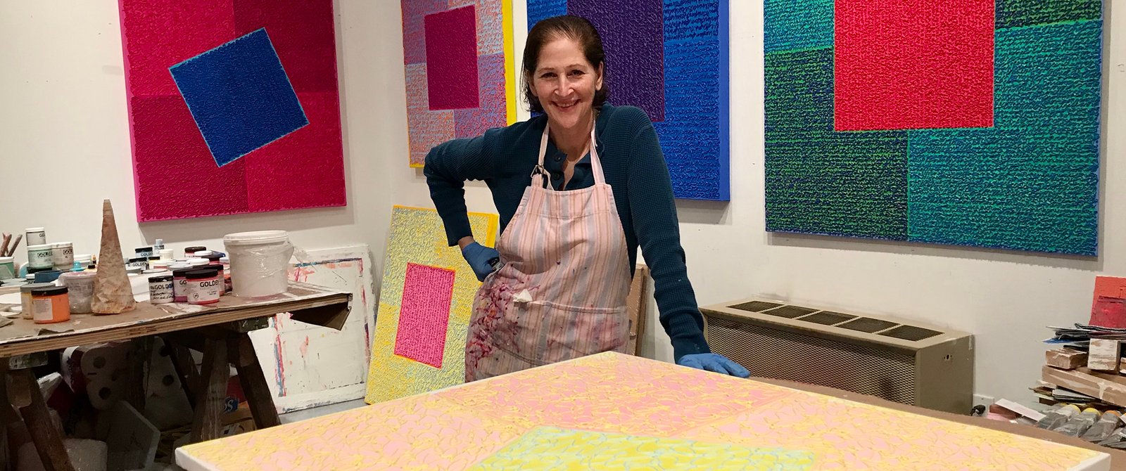
Louise P. Sloane has spent the last five decades mastering the art of geometric abstraction, creating a body of work that captivates viewers through its intricate balance of color, texture, and form. Her paintings, often anchored by the recurring motif of the square, invite us into a visual dialogue that is both deeply structured and richly emotive. Sloane’s use of color, combined with her distinctive mark-making, creates a tactile surface that draws the eye and stimulates the senses. Her mastery of this delicate balance between minimalism and expressiveness has earned her a well-deserved place in contemporary art, where her work continues to push the boundaries of geometric abstraction.
Sloane’s paintings are more than simple arrangements of shapes and color. They are layered with meaning, infused with complex contrasts, and built upon decades of exploration and innovation. Drawing inspiration from the American Minimalists of the 1960s and rooted in the geometric abstraction of artists like Kazimir Malevich and Joseph Albers, her work adds a modern twist to the genre. Her distinctive use of raised markings, color contrasts, and symbolic elements such as written words and number codes breathe new life into her compositions, creating a vibrant and thought-provoking experience for the viewer. Louise P. Sloane’s work bridges the gap between conceptual abstraction and tangible human connection, offering a truly unique visual and emotional experience.
Your work embraces minimalist ideologies while focusing on color and human mark-making. How do you navigate the balance between minimalism and expressive color in your paintings?
My inspiration for my works was from American Minimalists from the late 1960’s, some of whom were studio instructors to me during the early 1970’s. My goal then and now was/is to add to the conversation of the genre of minimalism while creating my own “signature style” which continues to be the addition of dense raised markings that in the beginning mimicked writing. Subtle colorations blossomed into deeper and more intense colors, as the colors enhanced the texture and luminosity of my work.
The square is a recurring motif in your work, creating a central structure for your paintings. What initially drew you to this geometric form, and how has its meaning evolved throughout your career?
My compass has been the use of the grid which over many years morphed into the square as a repetitive motif that anchors the works surface. Not always centered in the picture plane, the square, in its simplicity draws the viewers gaze creating a focus for the painting’s structure.
Your paintings often include complex color contrasts and layered textures. Could you share how you develop these textures and how they contribute to the emotional and visual experience of the viewer?
I layer colors, whether they are beeswax and later fused together with heat or applied paint with a brush. The “mixing” of the colors in situ adds additional movement and depth, as the layers are never completed covered and the no color obliterates what is underneath.
You incorporate written words, religious symbols, and number codes into your work. What role do these elements play in your abstract pieces, and how do they interact with the geometric forms and color?
I discovered that sometime in the later 1980’s that rather than utilizing markings that “suggested” writing, that actual written words, lexicons and symbols created a wonderfully engaging texture surface and this “writing” accentuated the the geometric forms and color contrasts.
Rogene Cuerden described your work as offering a tactile experience. How important is the physicality of paint and texture in your process, and what do you hope viewers feel when they encounter your work?
Texture is key to all of my work, be it monochromatic paintings on canvas, linen or metal or paintings on paper. The texture emboldens the surface, gives it depth and a tactile surface that is almost impossible to not touch. This feature has become a significant thread throughout my 50 years of painting professionally.
Lilly Wei mentioned the reconciliation between abstraction and representation in your art. How do you see your work fitting into this dialogue between modernism and postmodernism, and how do you approach narrative within your abstract compositions?
My work is inspired by geometric abstraction…Kazimer Malevich and the Supremist movement, later to become geometric abstraction, Joseph Albers Color studies, Joseph Itten’s color theories and the written word. Written communication separates humankind from other species. My works cross the bridge between conceptual art and abstract gesture and the use of color to emphasize surface texture. The narratives are personal: journals, poems, song lyrics that have meaning only to me – they are not meant to be “read” and are used only as vehicles for the paint’s color and depth. However, the “text-ure” engages the viewer as something recognizable if only the nuance of writing. The work forms a connection that crosses labels and movements.

